Lexmark Icons
Software-related icons designed while co-oping at Lexmark International, Inc.
Context
Tier 1 icons: Software and web applications sold on the Lexmark website
Tier 2 icons: Nested inside the applications
Opportunity
Design icons that represent the purpose and function of each software
Express creativity working within the Lexmark grid and color palette

Audience
Publishing Platform Retail Icon:
Retail businesses looking to produce price and ID signage for their productsTesting Assistant Icon:
School faculty wanting to optimize their grading process
Publishing Platform Retail Icon
Online software that designs and prints retail shelf edge signs, labels, and tags.
Research and Insights
Document presented to project managers showing internal and external benchmarking, concepting, and design ideation.
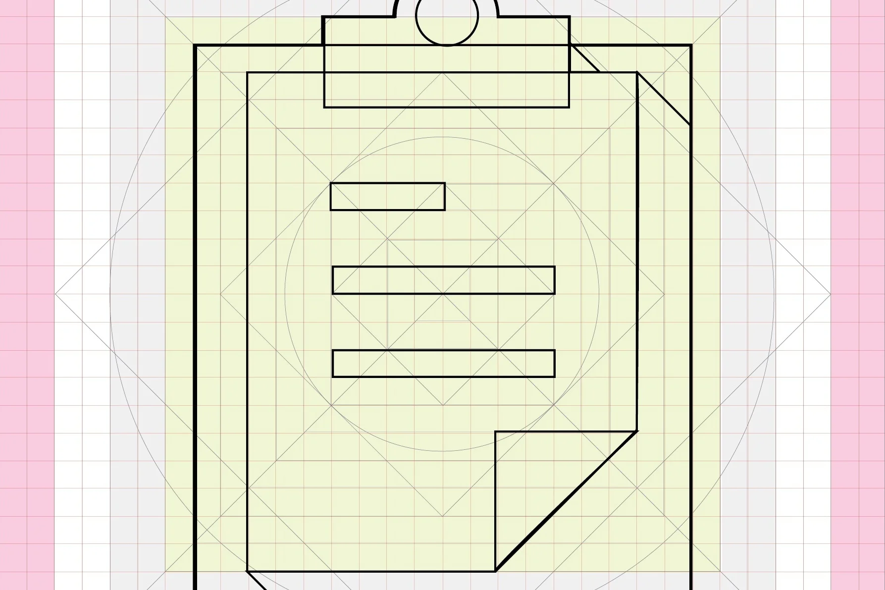
Tier 1 Icon Grid and Color Palette


Final Price Tag Concept Iterations
Additional Concepts
Testing Assistant Icon
Web based application that grades students' tests while tracking and analyzing the frequency of incorrect answers.
Brainstorming
Brainstorm session with another designer.
Range from education and test-taking to abstract concepts like data input/output and educational success.
Concept Sketches
Additional Concepts
Tier 2 Icon Style Exploration
Research and exploration for future Tier 2 icons
Analyzed current icon style trends and designed tier 2 icons for each trend
No strict color pallet and grid system
Line Art Style
Pixel Art Style
Semi-flat Style
Flat planes use value and cast shadows to imply form and depth.
Semi-flat Continued: Final solution
Same structural guidelines as Tier 1icons
Provides tighter visual cohesion between tiers 1 and 2
Broader color palette provides warmth to the otherwise grey and green system