Bumi Responsible Beauty
Sustainable-beauty compacted body wash concept designed while co-oping at Procter & Gamble.
Context
Sustainable products are only 16% of the market, yet bring in 50% of market growth.

Opportunity
Identify a structure for communicating a sustainable brand to sustainable minded consumers.

Audience
Sustainable-minded millennial and Gen Z women
“The planet is precious, I need brands to reduce their impact and have sustainably sourced ingredients.”
Sustainable-beauty online trends
Audited 17 websites to gather insights on effective design and messaging.
Insight 1: Places to start sustainable messaging
1.) Branding
2.) Home Page
3.) Scroll down
4.) Tab/Click
Insight 2: Design
Clean layouts felt contemporary and authentic
Pallets
Earthy
Pastels / Low Contrast
Bright and Bold
Insight 3: Bigger Problem
Issues sustainable brands helped solve
Consumer Testing: Competitive brands’ websites
How consumers respond to competing brands’ online approaches
3 sustainable-beauty brands
Different messages
Different package claims
Different aesthetics
30 sustainability-minded consumers
Women 18 - 35
Any income level
Screener: “The planet is precious, I need brands to reduce their impact and have sustainably sourced ingredients.”
Consumer Feedback
By Humankind
Positive:
Earthy color pallet
Natural and minimalist product photography
Evidence supporting claims
Negative:
Too much sustainability messaging distract from:
Products they’re selling
Price
Product performance
Love, Beauty, and Planet
Positive:
Product performance info
Bright colors and imagery
Fun and engaging packaging
Negative:
Large claims without stats felt gimmicky and untrustworthy
Wanted both ingredients AND packaging transparency
Bite
Positive:
Addressed learning curve
Homepage addressed all messaging points
Minimalist layout and fresh pastel colors
Negative:
No product experience or performance info
Content Structure
Trends and consumer insights applied to our brand’s communication strategy
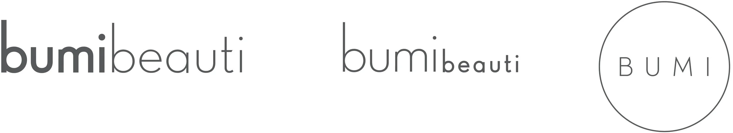
Option 1: Minimalism
Inspired by the compacted product
Low-fi
Mid-fi
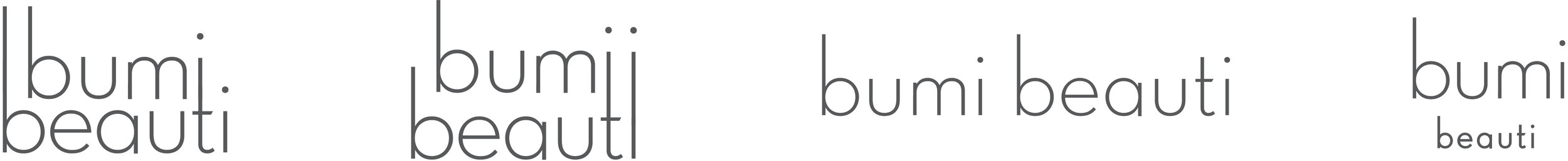
Hi-fi
Option 2: Condensed Serif
Condensed serif represented compaction
Lo-fi

Mid-fi
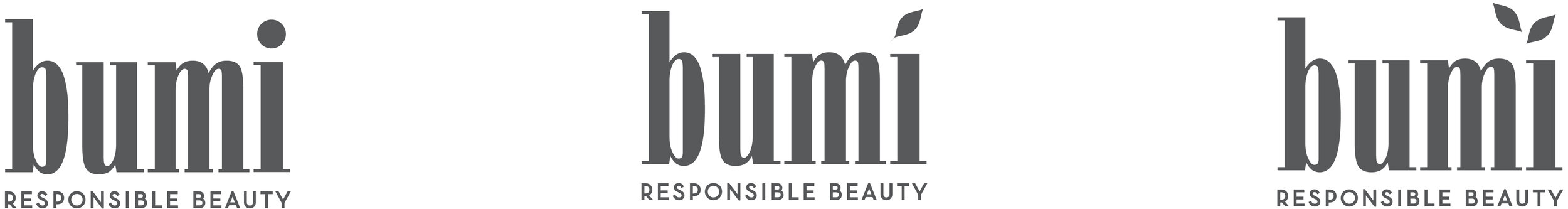
Hi-fi

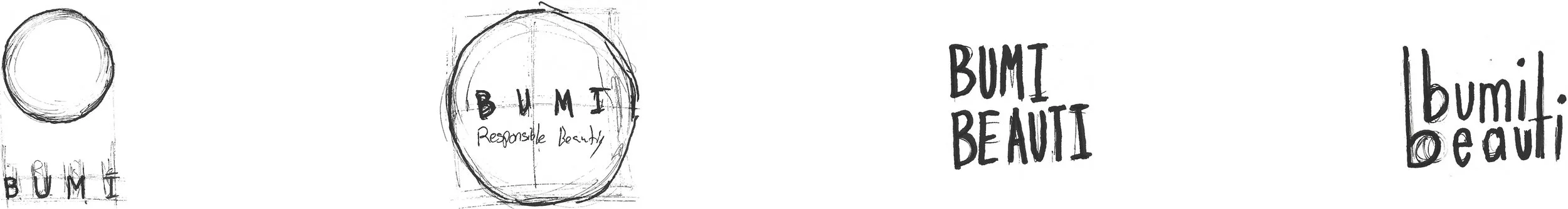
Option 3: Beautiful Earth
Circle and cross is a symbol for the earth
Botanicals represented beauty and naturals
Low-fi
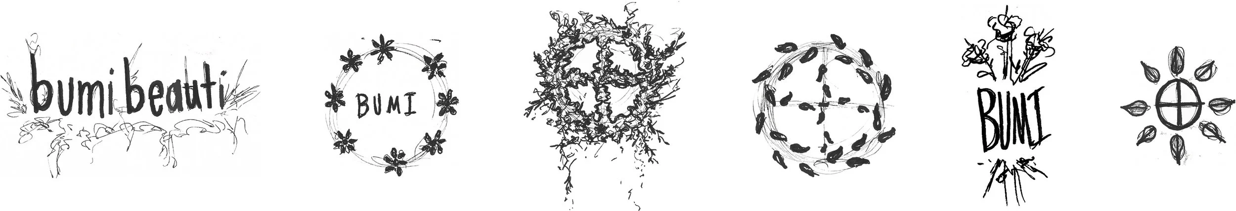
Mid-fi
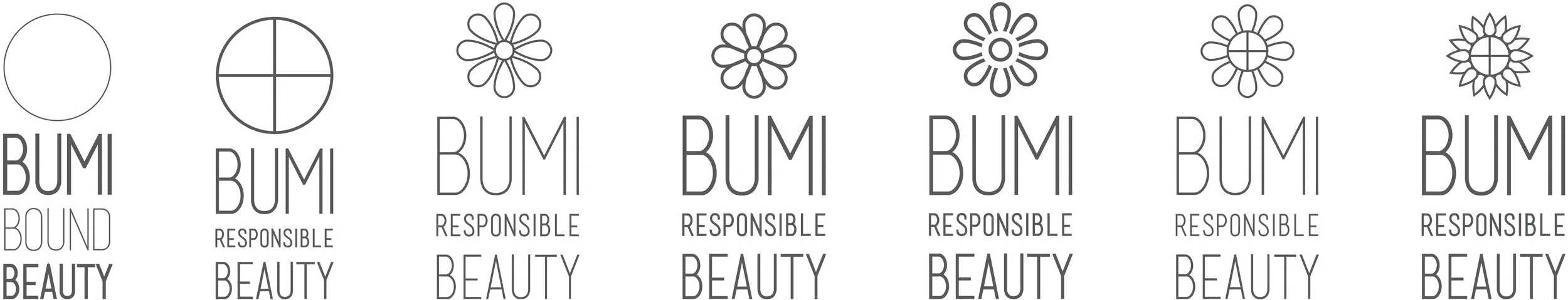
Hi-fi
Consumer Testing: Logo
15 sustainable-beauty minded consumers
Insights
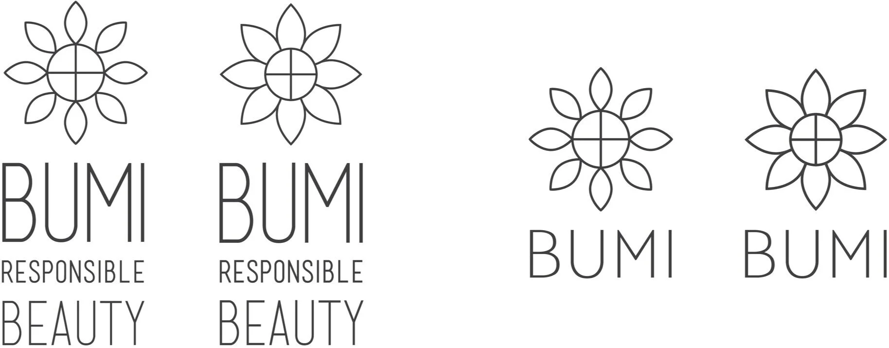
Sunflower option was natural, approachable, and trustworthy
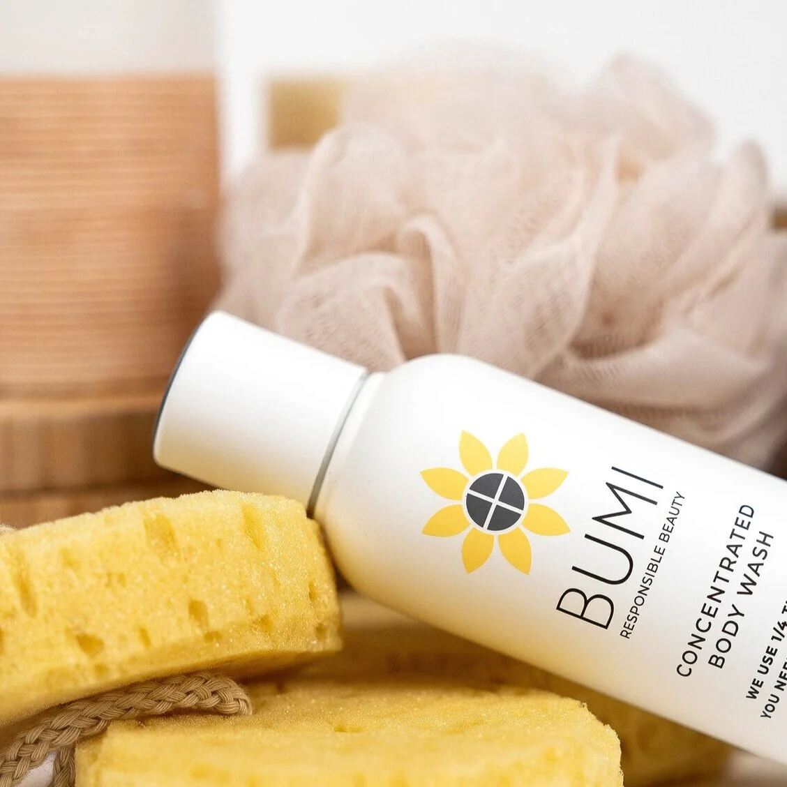
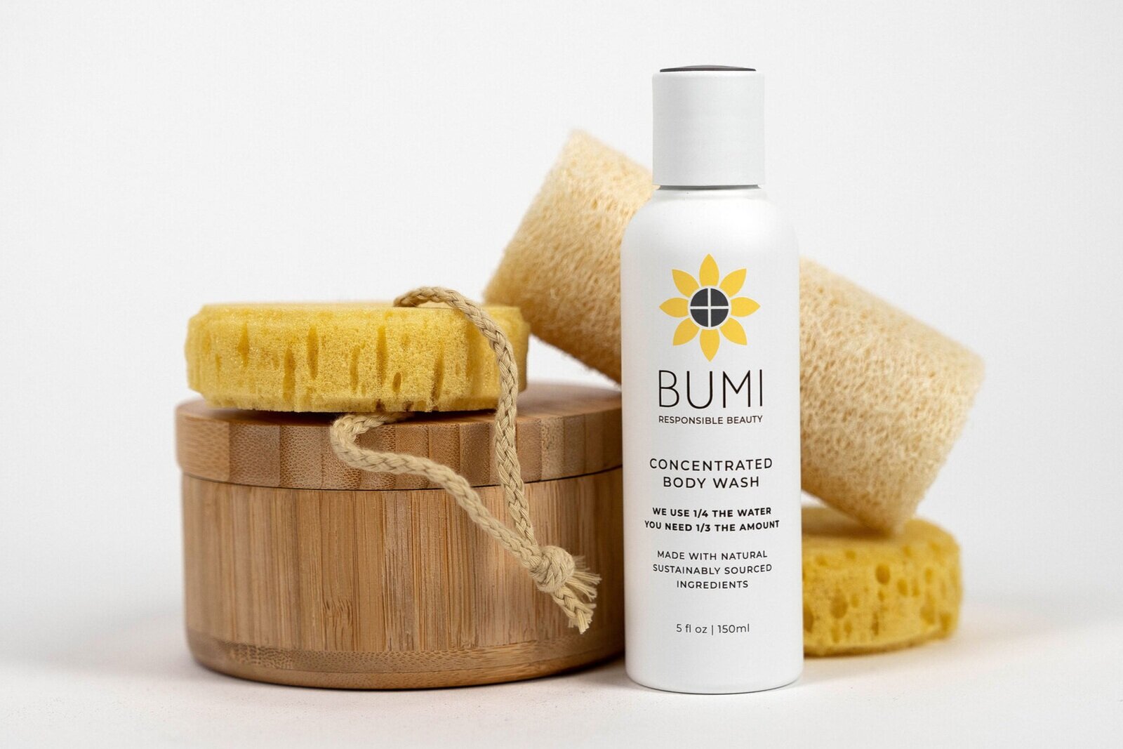
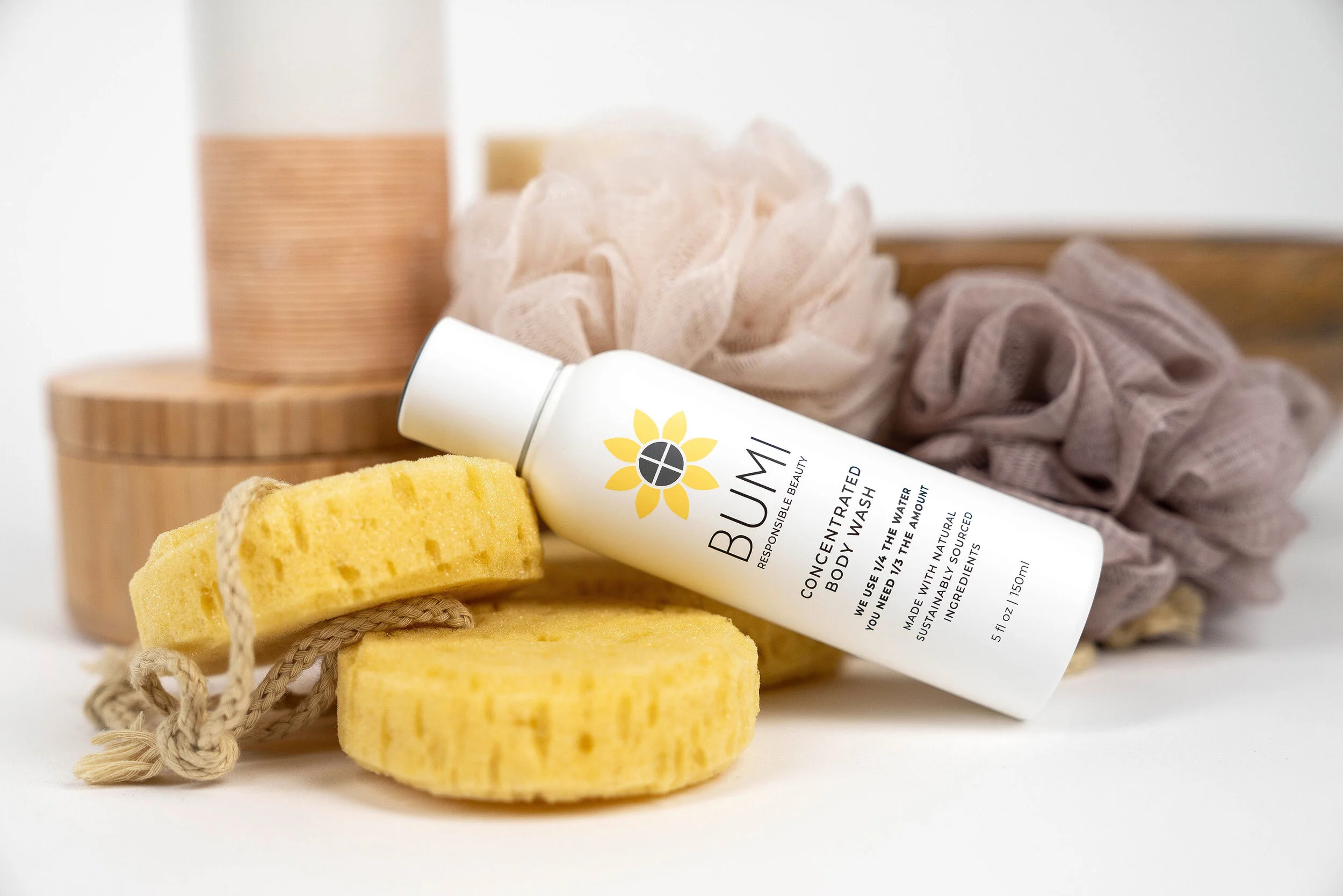
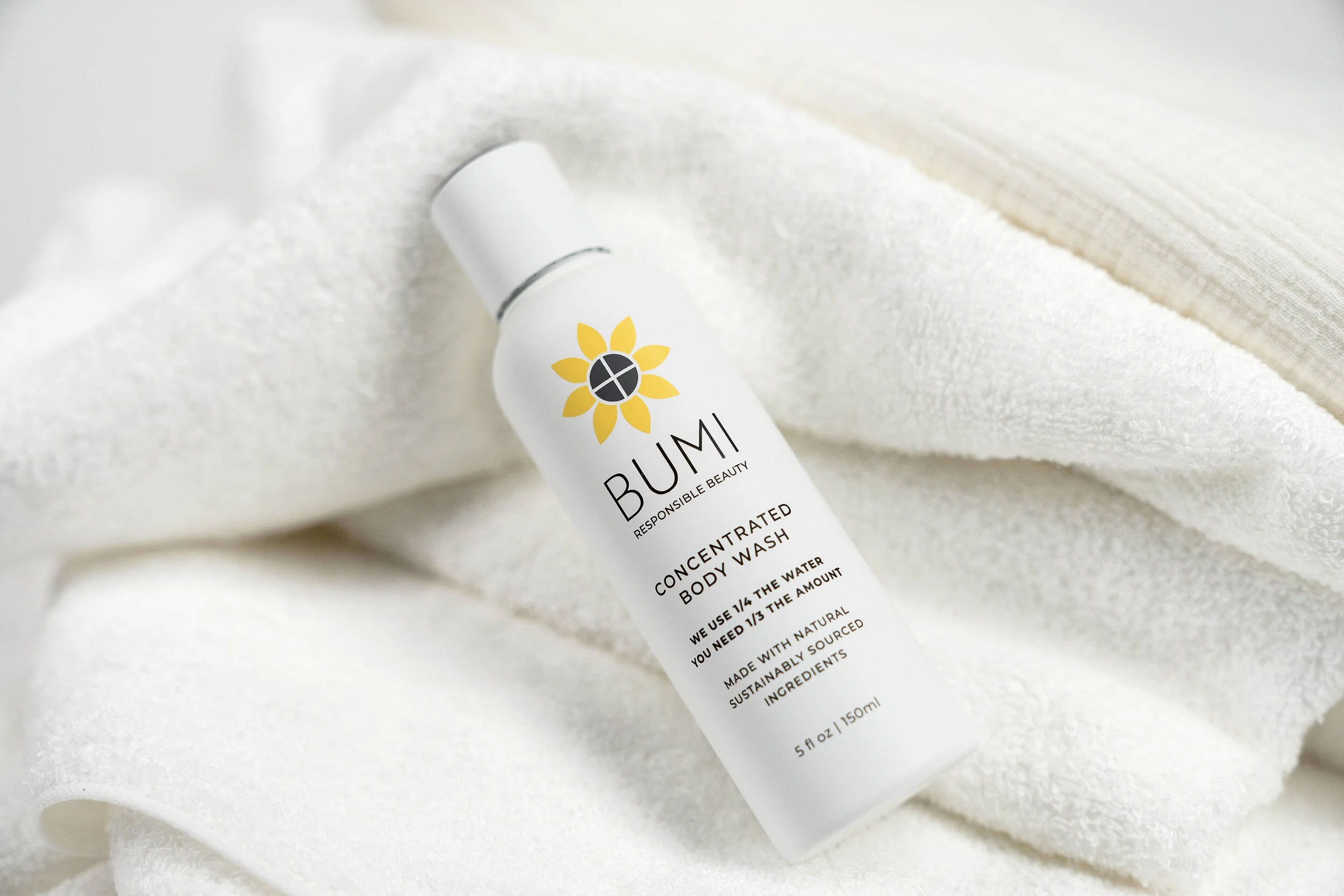
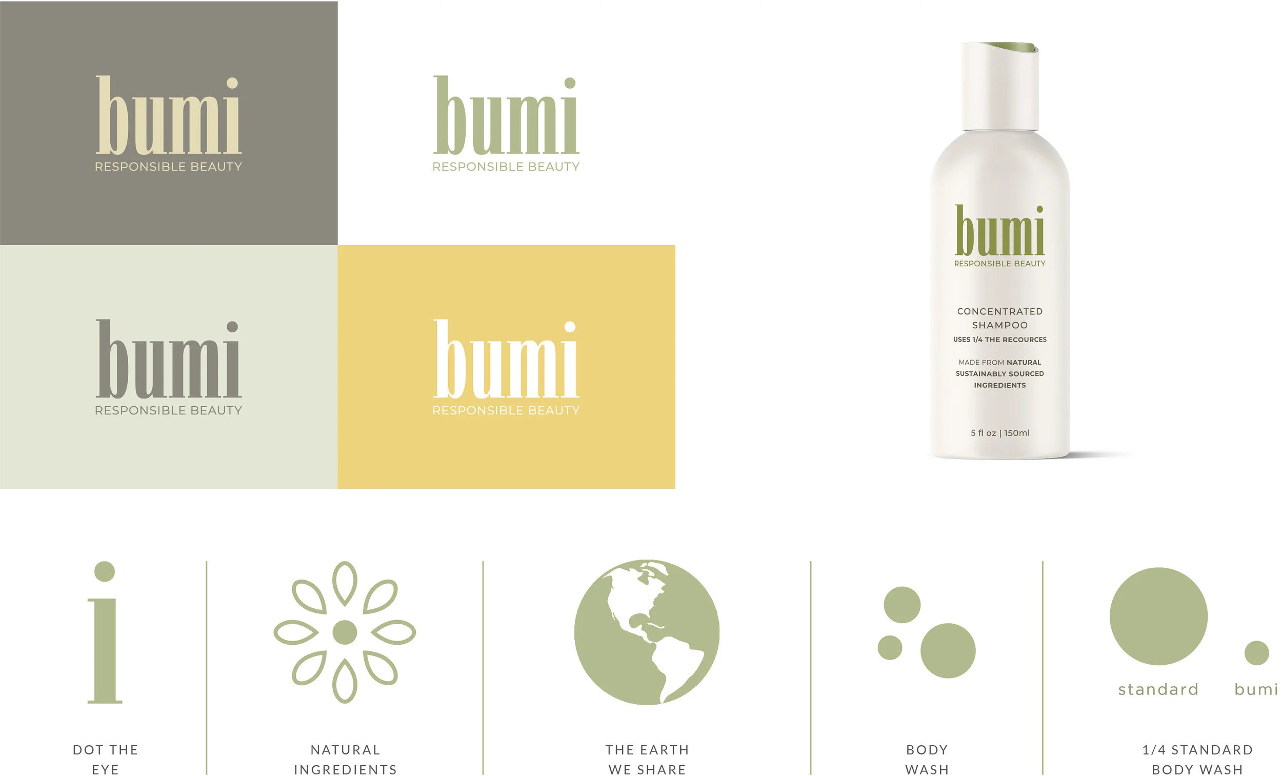
Final Design
Kit of Parts
Iconography
Package Design
Front
Identity
Sustainability and point of Difference
Ingredient Transparency
Back
Directions
Plant-base Recycled Packaging
Ingredients List