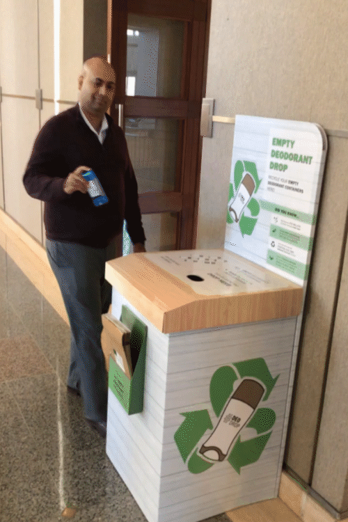
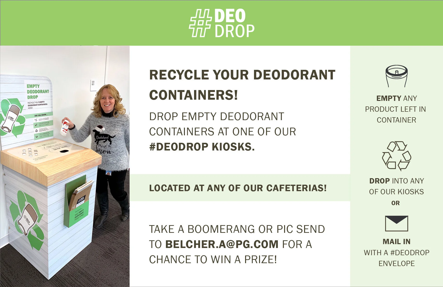
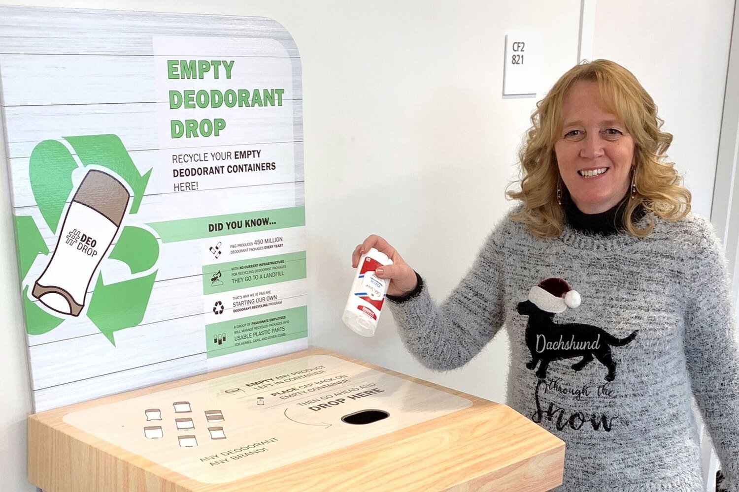
#DeoDrop
Internal Procter and Gamble initiative recycles used deodorant packages that would otherwise go to landfills. Kiosks that collect packages are installed at various P&G Cincinnati locations.
The Problem
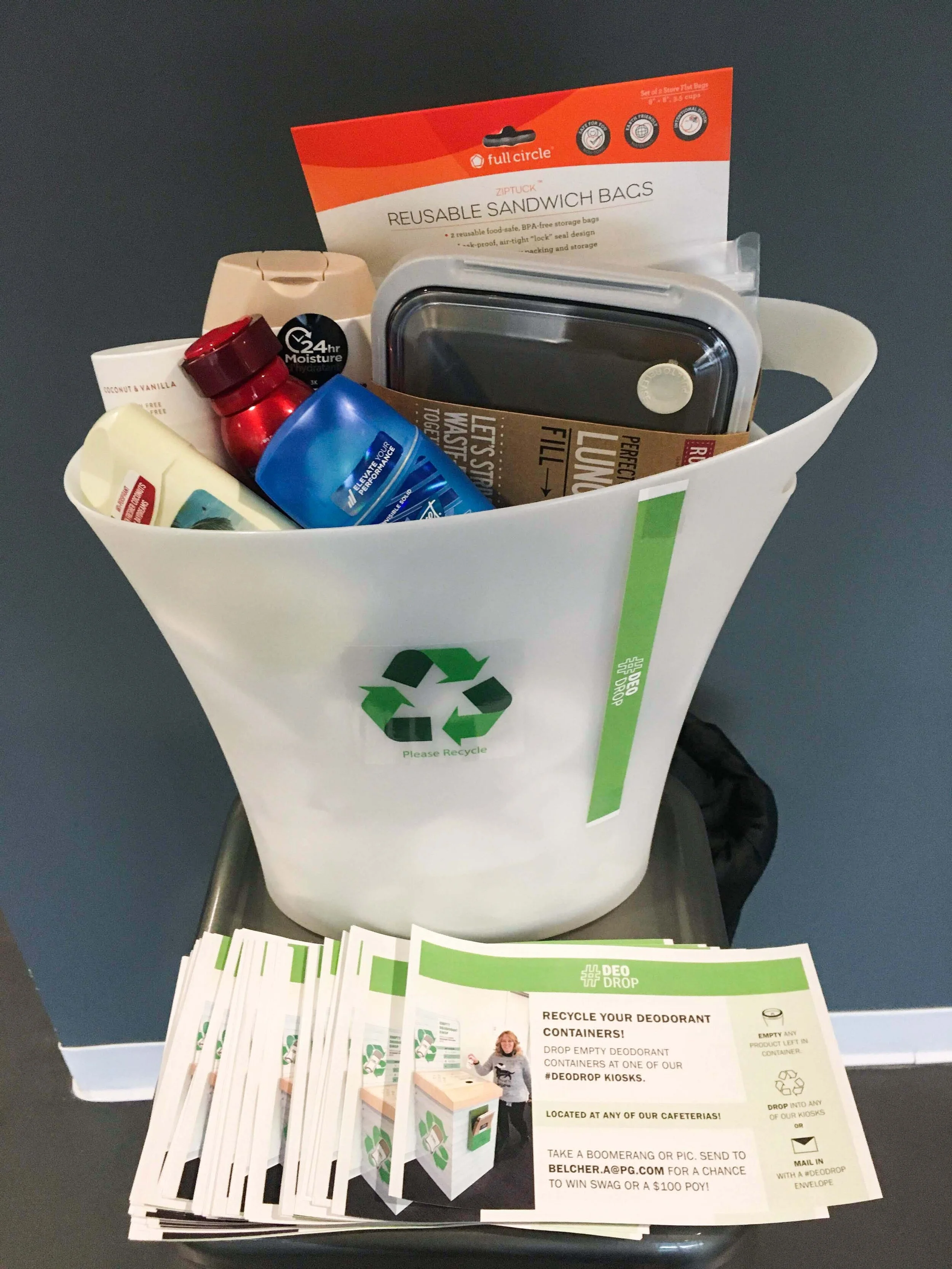
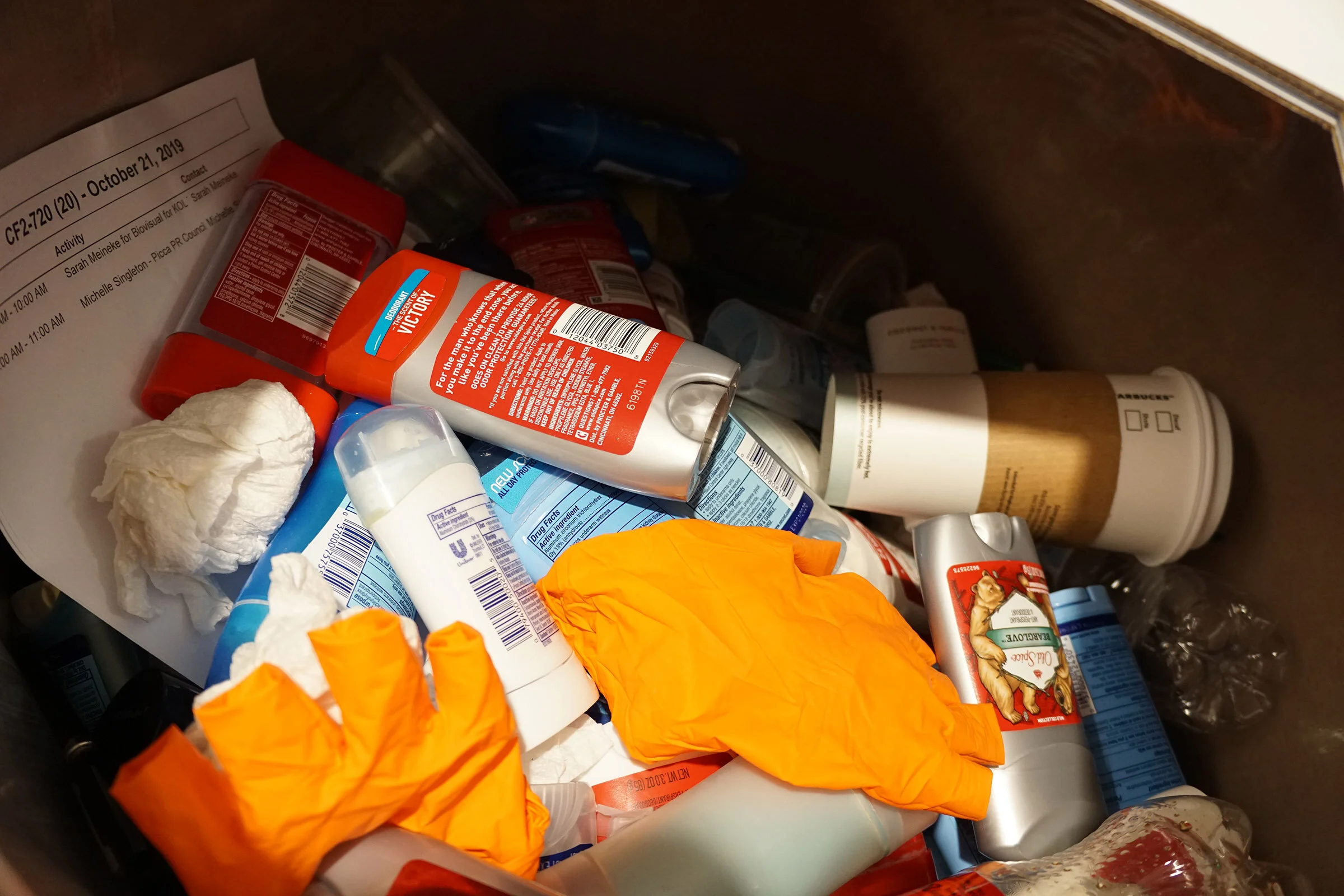
Many don’t know about the initiative, overlook the kiosks, and are unaware of their purpose.
People assume the kiosk is a standard recycling bin, disposing of all types of recyclables (not just deodorant containers) and sometimes trash.
Business Objectives
Get people to recycle their deodorant containers at P&G
Raise awareness of deodorant recycling initiative
Increase participation
Design Objectives
Improve kiosk’s graphics for optimal far-away and up-close communication and user experience
Create a visual identity that:
Stands out from standard recycling bins
Clearly communicates purpose
Can be used for kiosk, emails, and flyers
Analyzed old kiosk’s communication hierarchy
1. Earthy plants and textures
Wood texture successfully stands out from other recycling containers.
2. Recycling arrows
Compete with plant illustrations (scale and color)
Deodorant icon lost behind recycling symbol and against wood texture.
3. “Project Snowball” Title
Not relevant to the function of the kiosks or purpose of the initiative.
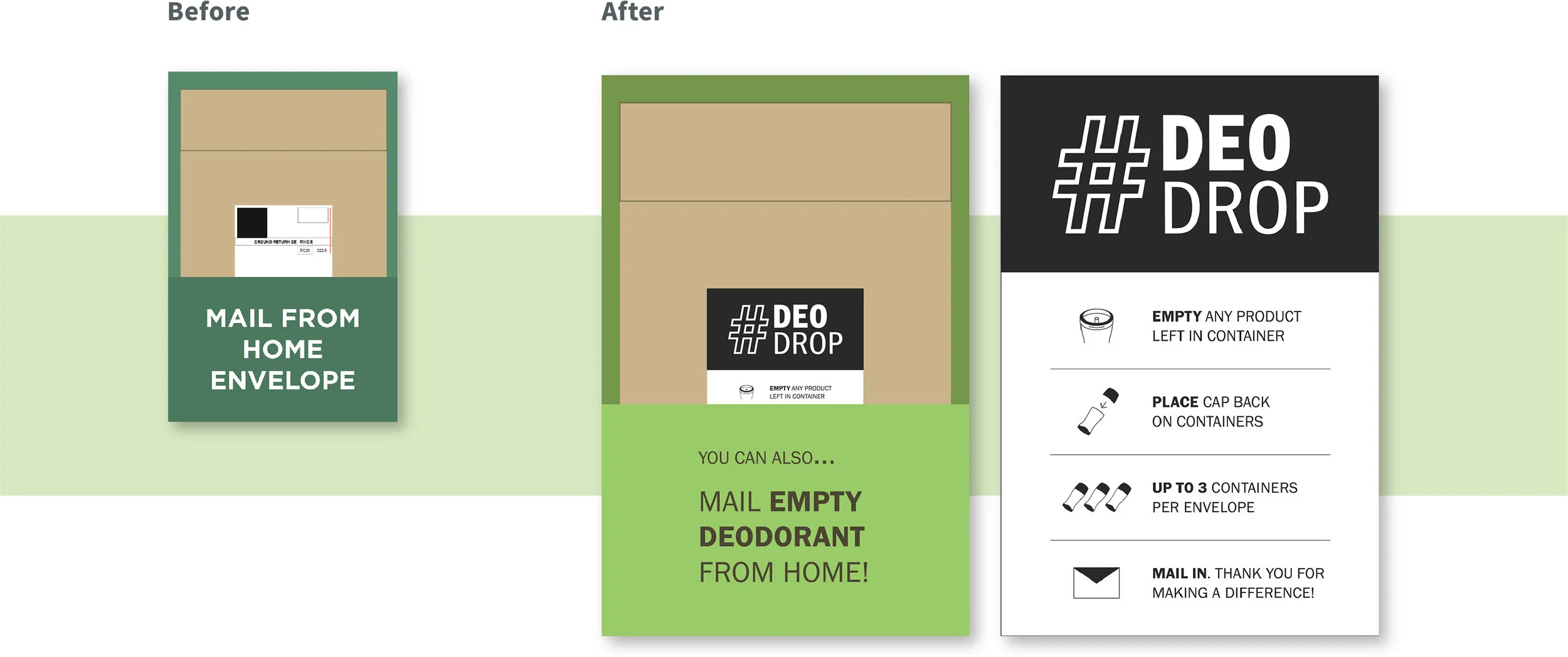
4. “Mail from home”
Audience doesn’t know it’s a secondary option.
Lack of overall clarity prevents users from knowing what they’re mailing and why.
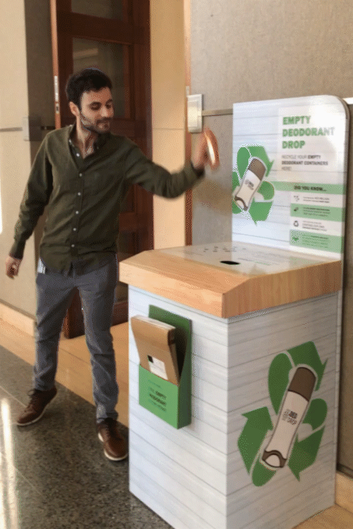
Identity Design
Graphic: Deodorant Container + Recycling Symbol
Stands out from traditional recycling symbol, but still immediately recognizable
Word-mark: Deodorant + Drop
Communicates the purpose of the kiosk
Initial Process
Refined Process
Final Identity
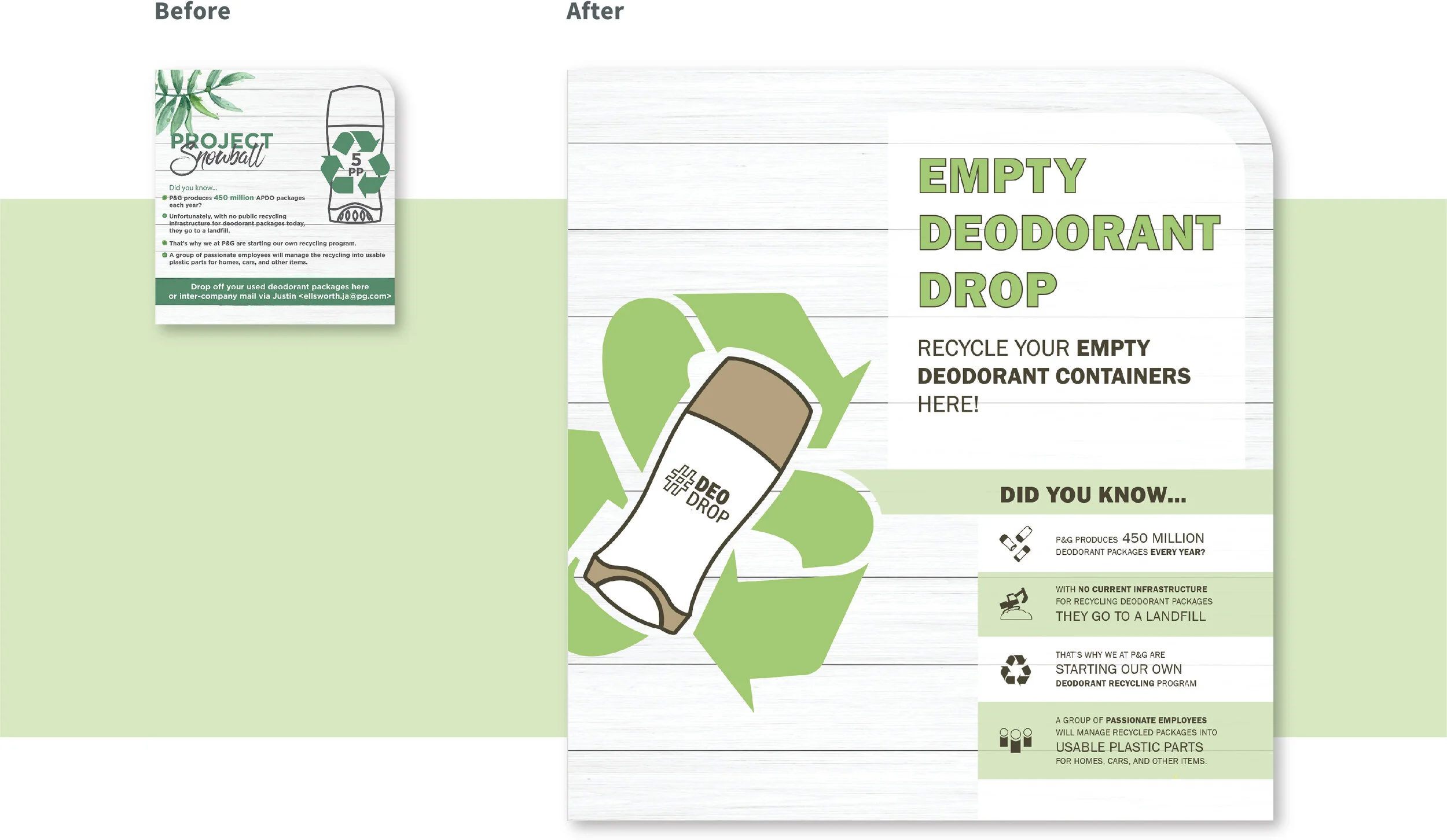
Head Board
Header
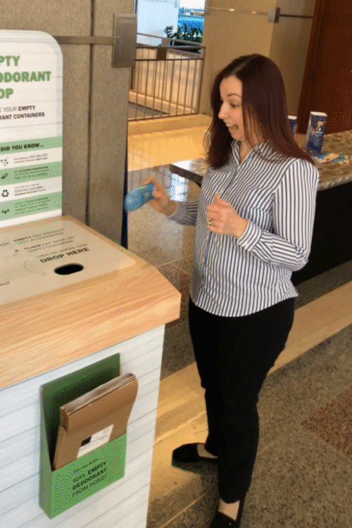
Before: “Project Snowball” title is irrelevant to the purpose of the kiosk and initiative.
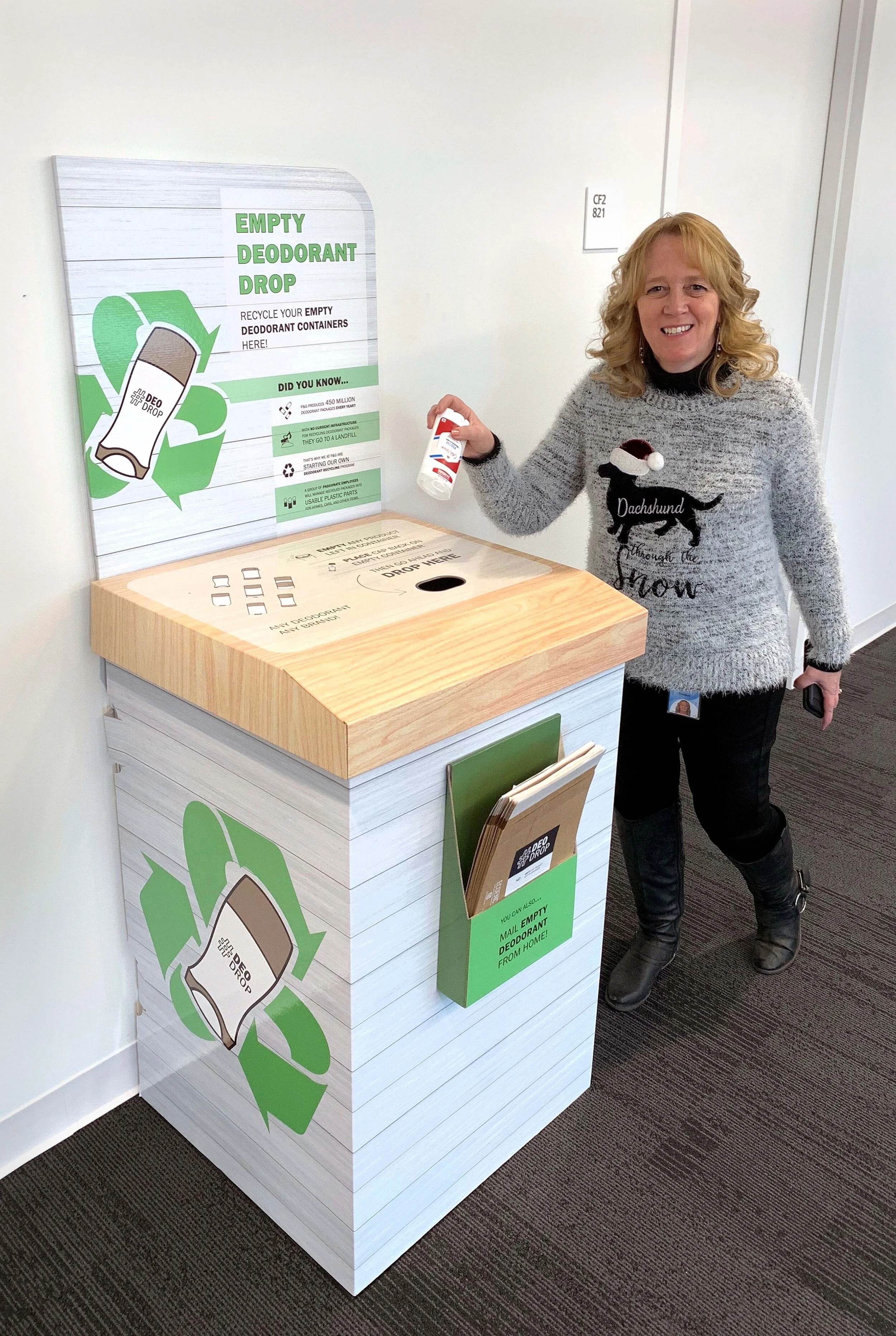
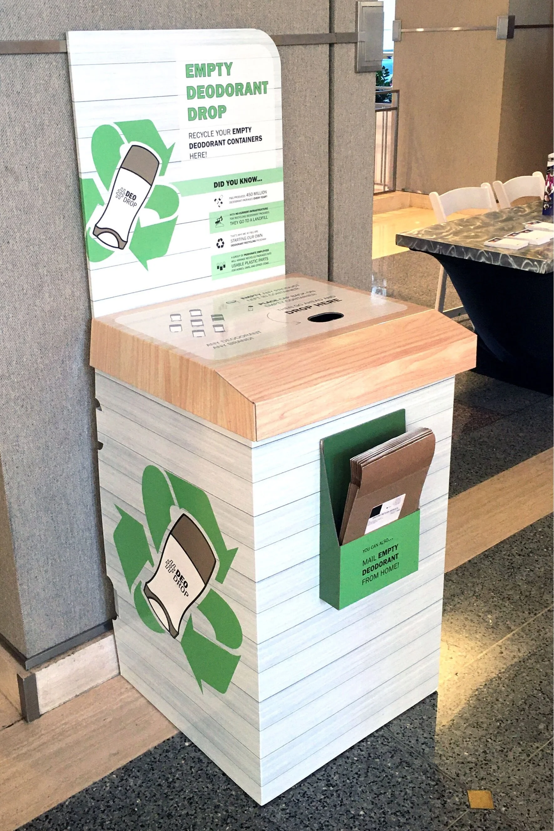
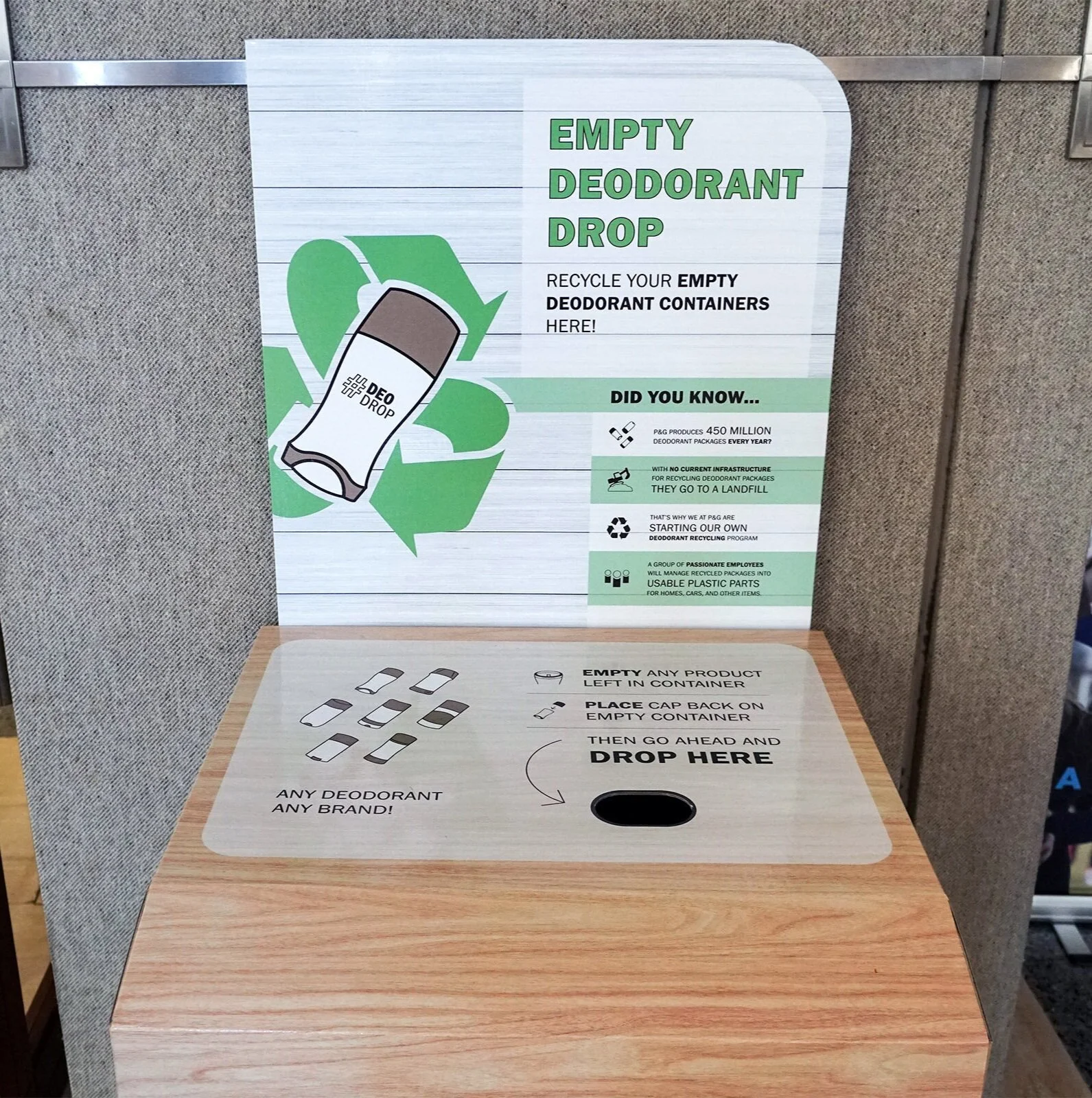
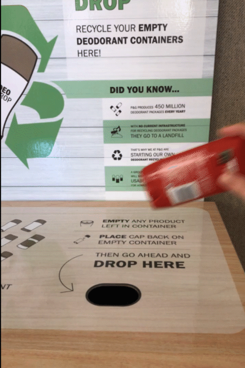
After: “Empty Deodorant Containers” communicates kiosk’s purpose and prompts audience to recycle empty containers.
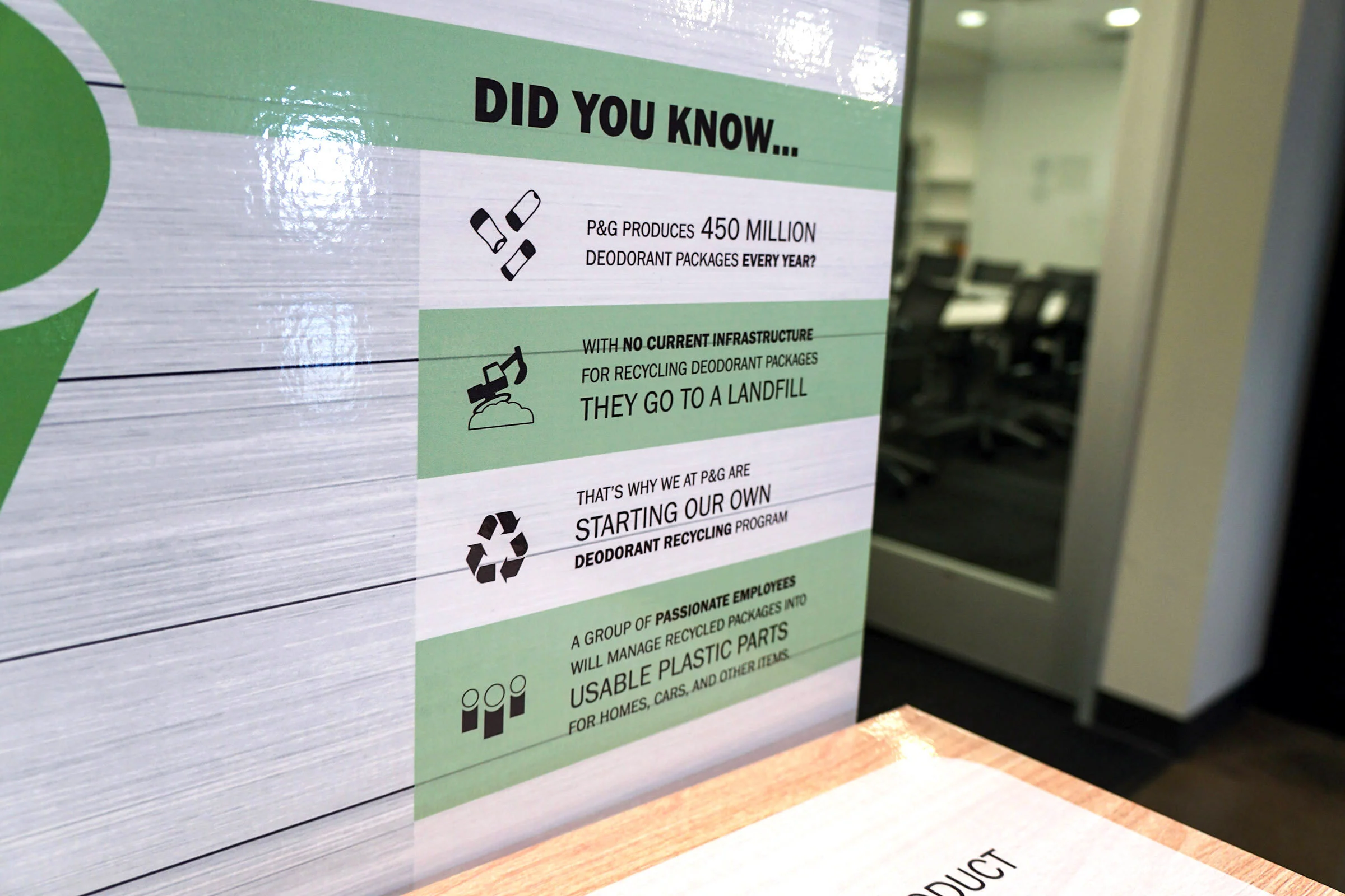
“Did you Know” section tells the story behind the initiative
Before: Text is hard to read against the wood texture. Long line length is difficult to read .
After: Icons help communicate story, type treatment makes skimming easier, graphic shapes provide better contrast for reading.
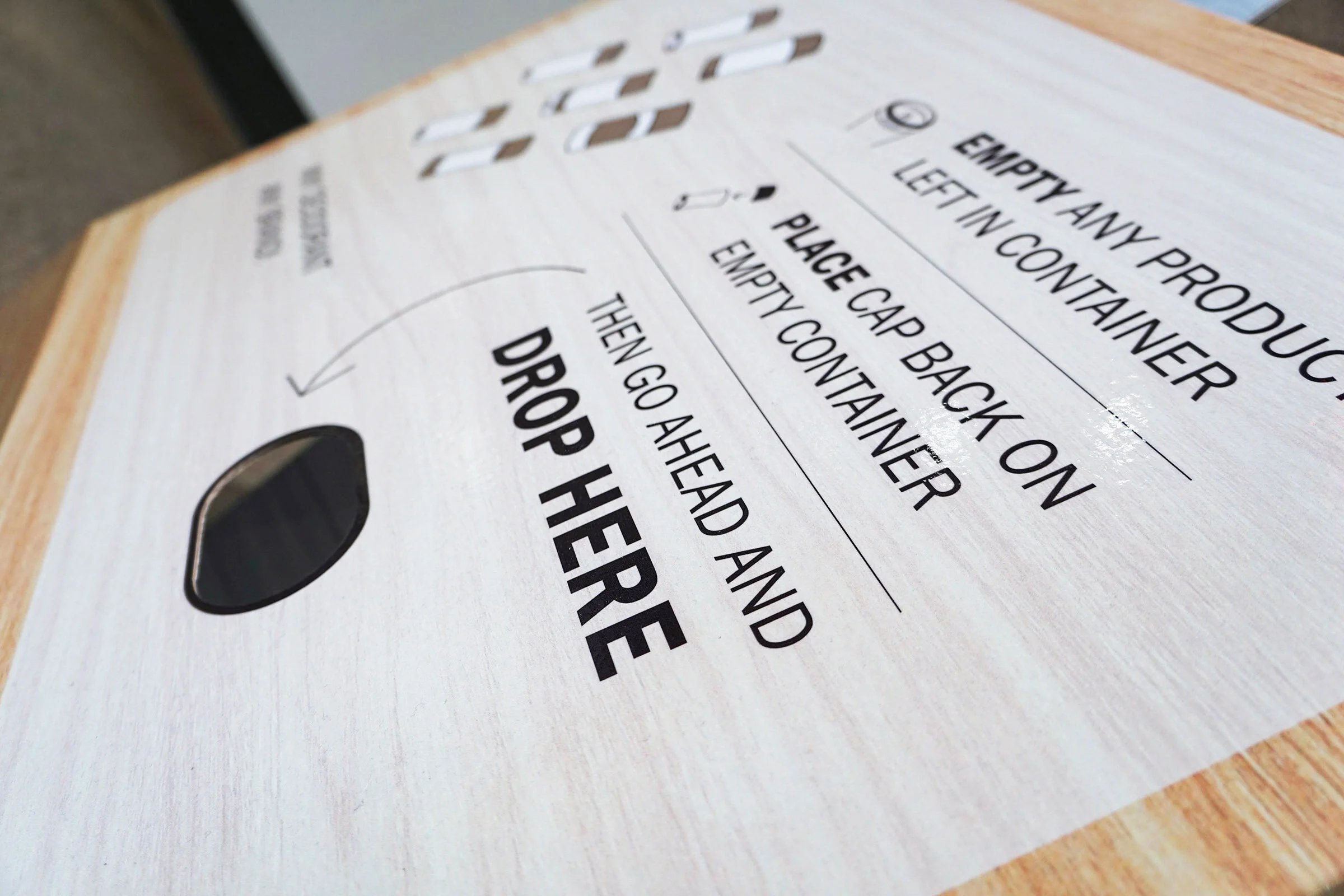
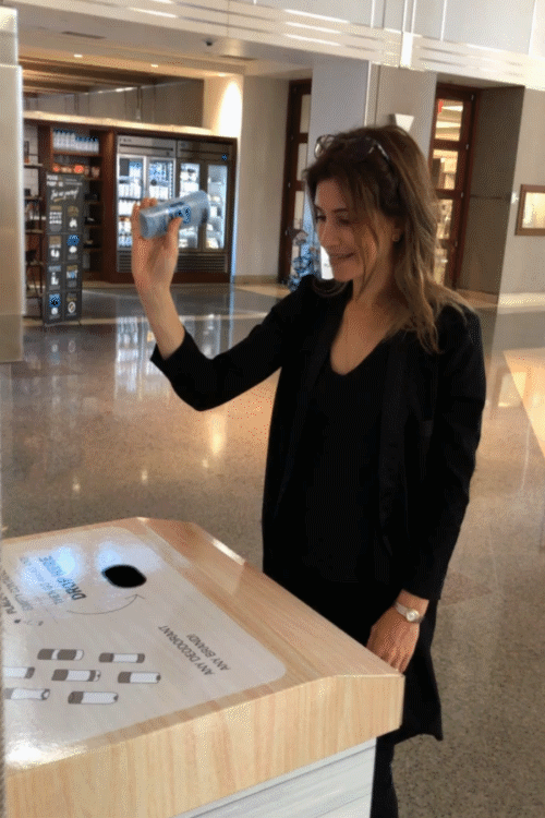
Lid
Before
Language is not clear and does not tell user what to do
Deodorant icons are illegible against the wood texture and blocked by the big arrow
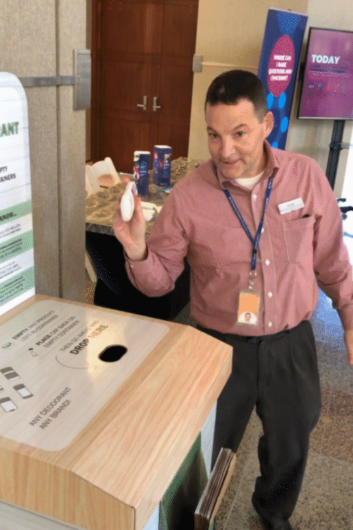
After
Deodorant icons are legible, communicating any deodorant, any brand.
Clear icons and instructions for proper disposal
Arrow guides the viewer to the drop slot.
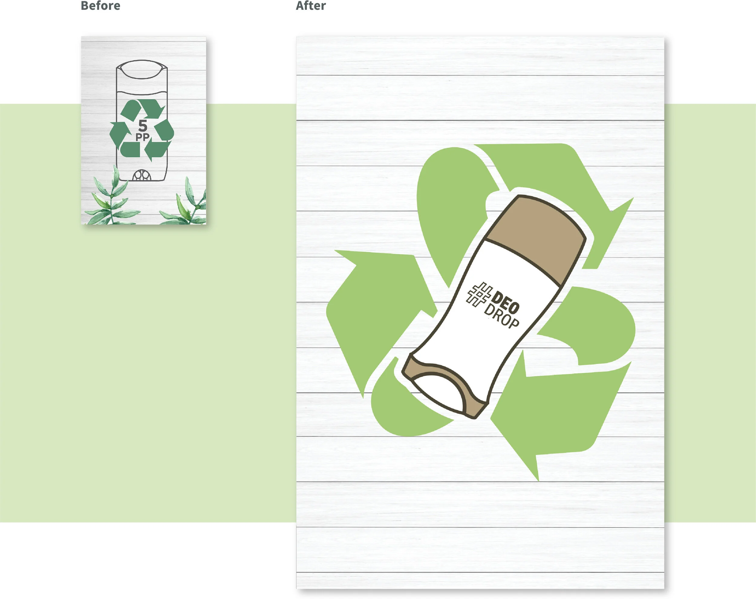
Side Panel
Before
Deodorant icon is lost behind the recycling symbol
The plant illustrations and recycling symbol compete
After
Graphic identity is visible from far away
Deodorant container and recycling symbol lockup is more clear and interesting
Envelope and Sticker
Mail-from-home presented as a secondary option.
The sticker provides instructions for mailing envelope from home
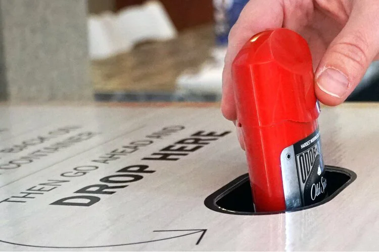
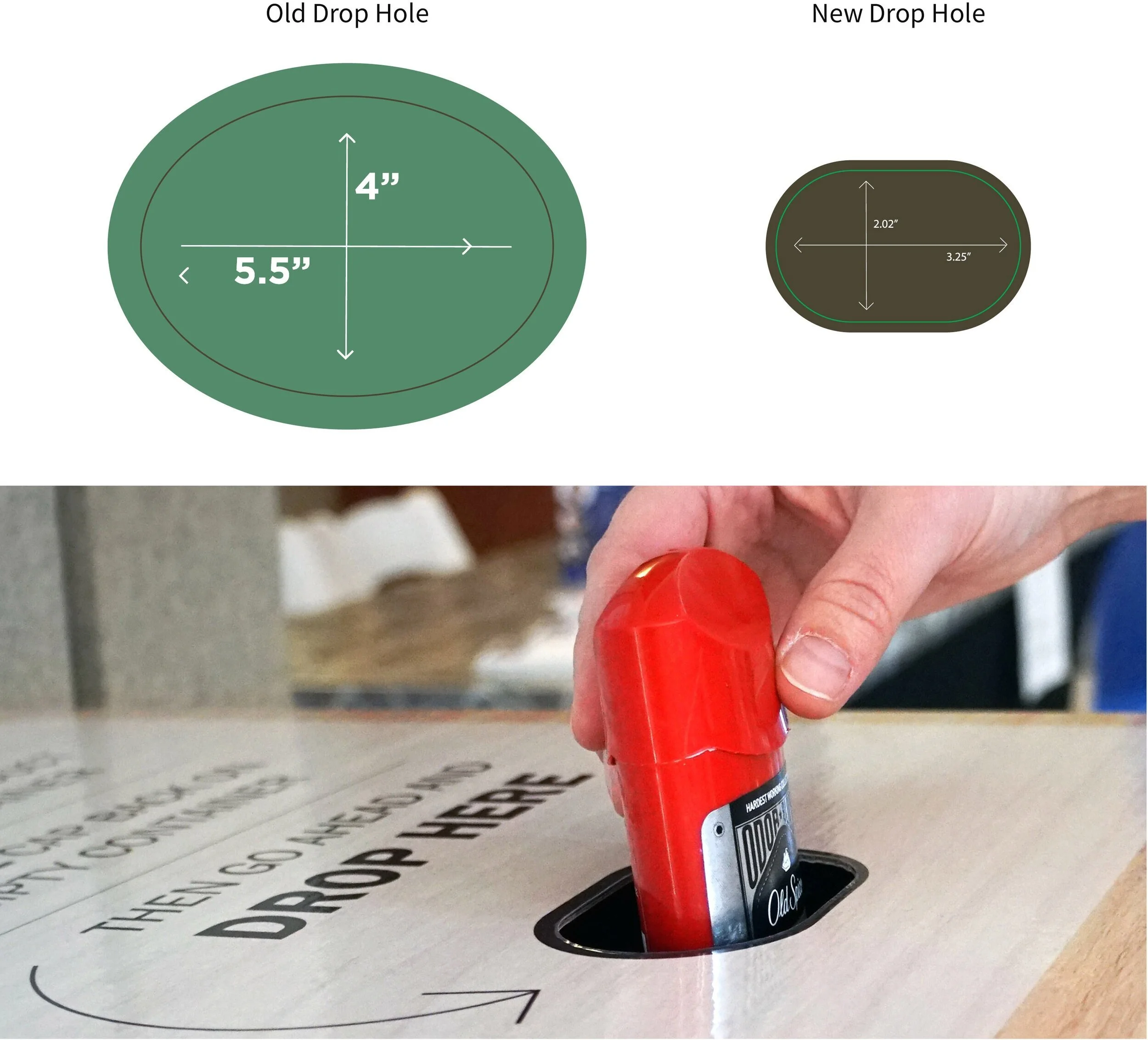
Drop Slot
Kiosk’s drop-in slot reduced significantly to prevent users from dropping in other recyclables.
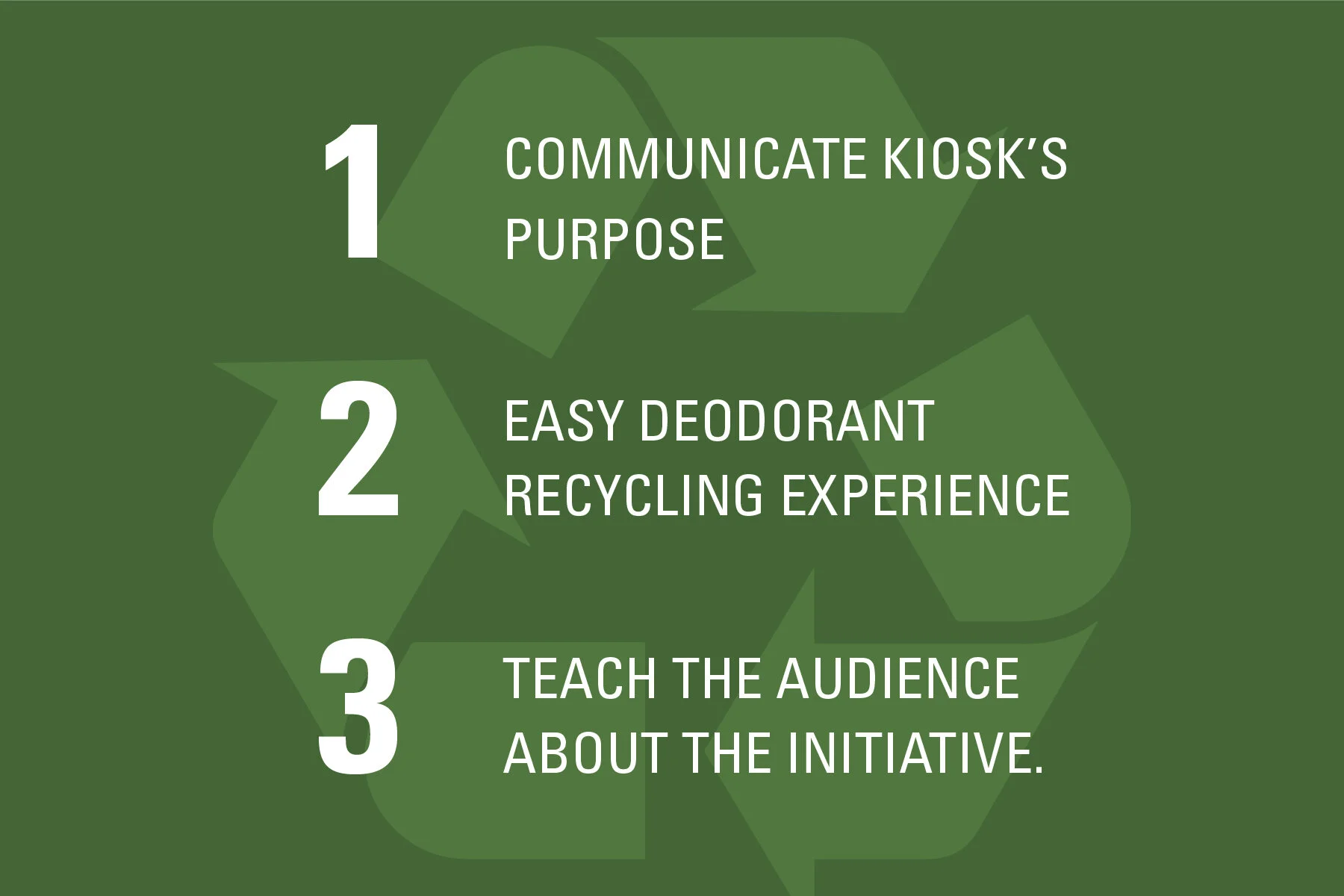
New kiosk’s communication hierarchy
1. Green colors and natural textures
Wood texture stands out from other recycling containers
Green symbolizes sustainability
2. “#DeoDrop” Title
Initiative identity visible from far away
Deodorant container + Recycling symbol communicates kiosk’s purpose
3. “Empty Deodorant Drop”
Call to action
4. “You can also Mail from Home”
Clear secondary option