4th and Long Brand Identity
Brand identity and promotional material designed for up-and-coming country musician 4th and Long.


Context
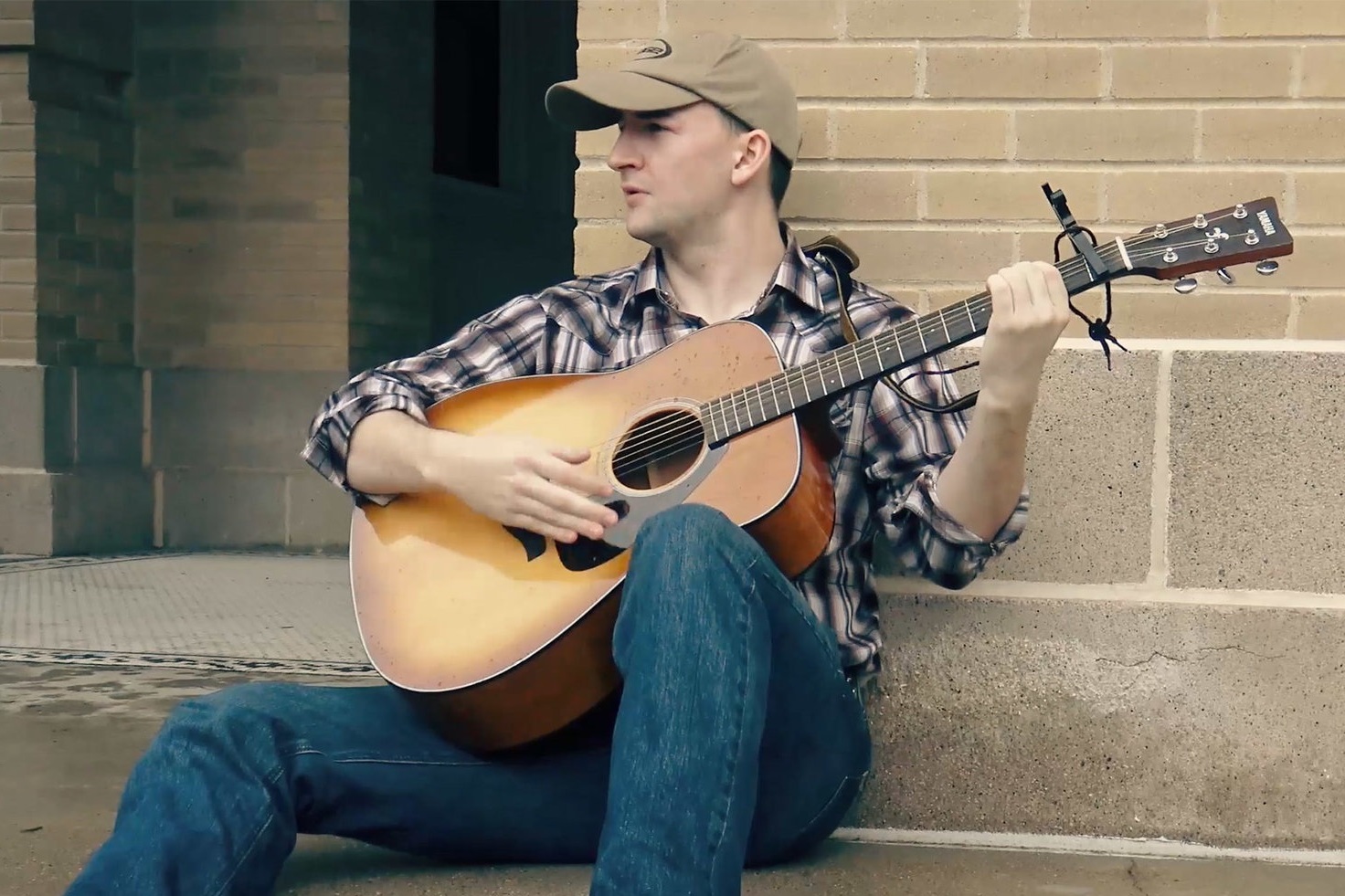
Mark Toler’s music is described as a contemporary mix of Johnny Cash and Garth Brooks. Mark wanted a logo and brand identity to utilize across social media platforms and printed promotional materials. Mark’s passion for football motivated his choice of 4th and Long as the name for his band.
Opportunity
The identity that best described his music should be sophisticated and masculine, without feeling overly serious or "stuffy".
Audience
Millenials
The primary intended audience is closer to his age (in their twenties or thirties), who are more likely to actively participate with 4th and Long’s social media and music streaming presence.
Older
Room was left for an older audience who may be interested in Mark's Johnny Cash covers.
Initial Logo Concept Sketches
The first iterations explore typefaces and imagery that match the southern vibe Mark was hoping for. We were both interested in the concepts that contained additional imagery beyond just type.
Refined Concept Iterations
The logo needed to reflect Mark's two greatest passions, music and football. In these iterations, the band name was juxtaposed with Mark's acoustic guitar and a football. The most interesting showcased the football as the body of the acoustic guitar.
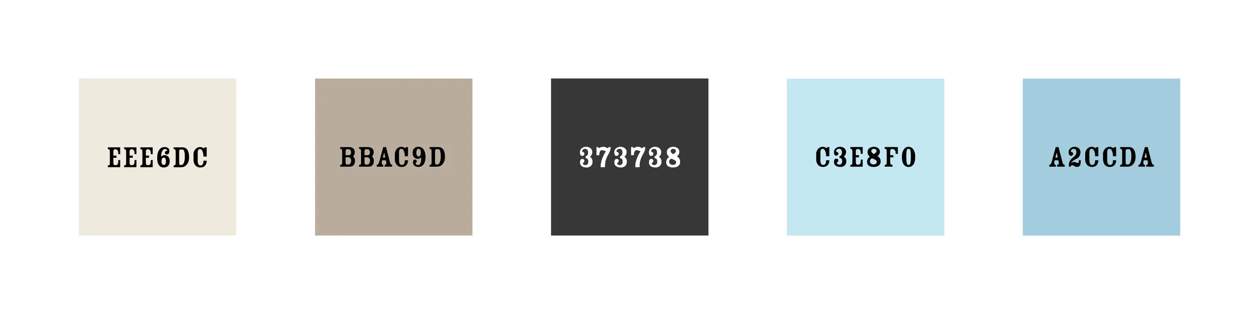
Final logo on a grid with color scheme
Promotional Posters
The guidelines were incorporated into posters promoting Mark's first full length album, "It All Starts with a Chance", which was released on iTunes and Apple Music. The track list was collaged and rotated as a textural element, encouraging further investigation from the viewer.
Promotional designs for Instagram
Designs promoting Mark's activity that were heavily inspired by the posters, but are more stripped down for the smaller screen social media platform.
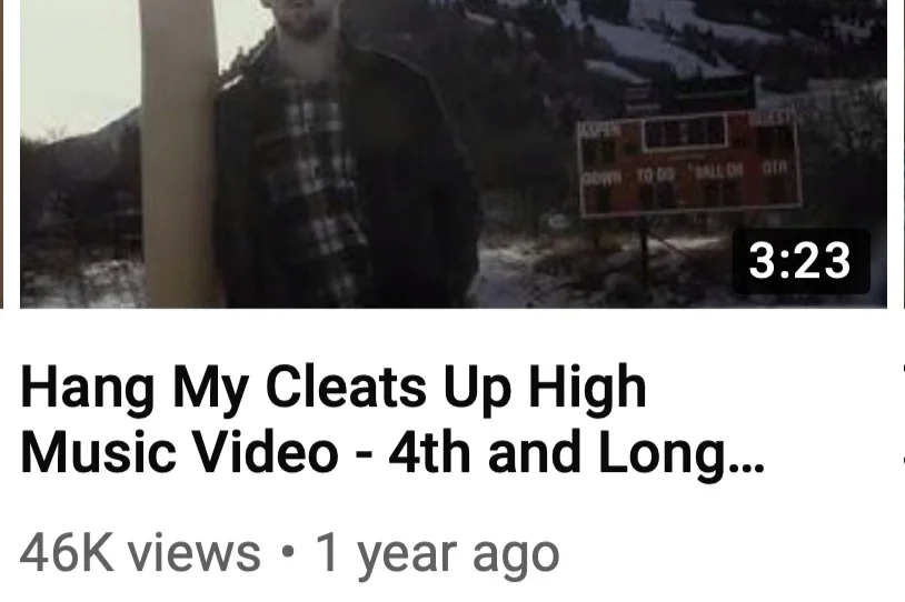
YouTube Banner and Icon
The Fourth and Long youtube channel is Mark's larges marketing platform with each of his videos receiving thousands of views. The banner promoting his album was straightforward while communicating the overall vibe of the brand. 4th and Long's logo was broken down to its simplest form conforming to YouTube's icon dimensions.